Visualizing distributions
A few large purchases can pull the average above what most customers spend. Plot purchase amounts by percentile to see the median, the spread, and the largest orders.
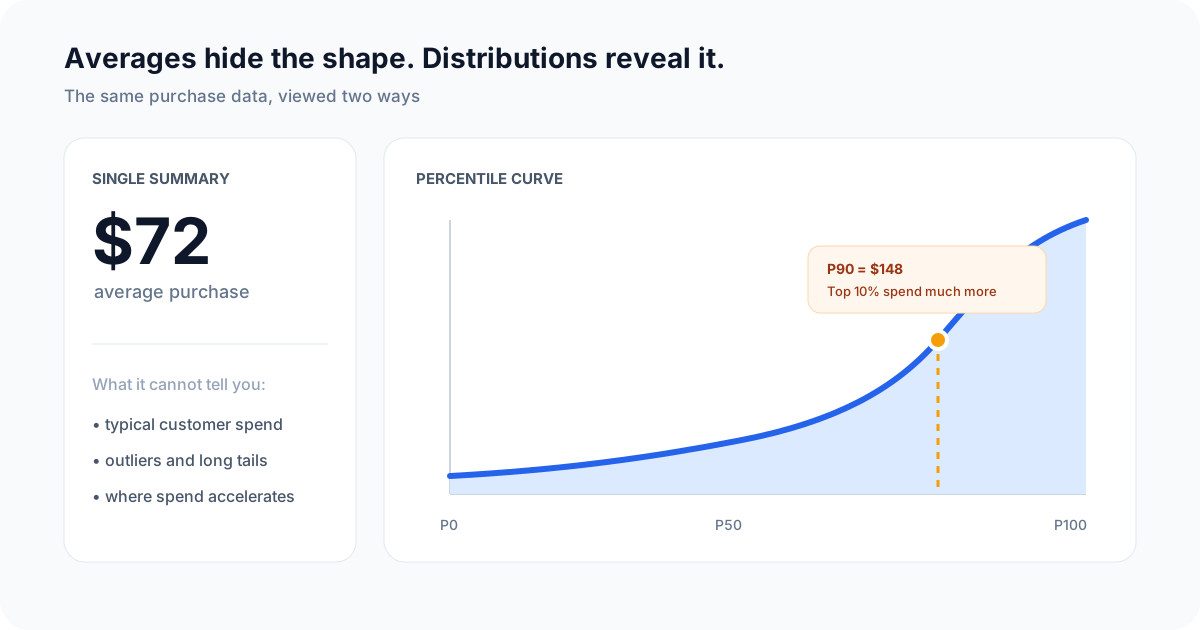
A percentile curve shows where purchase amounts accelerate and how far the long tail extends.
What you will build
You will log individual purchase amounts, query the value at every percentile, and chart the result. Unlike an average, this curve answers questions such as:
- What does a typical customer spend? Look near P50, the median.
- Where do high-value customers begin? Compare P75, P90, and P95.
- How extreme is the long tail? Compare P99 with the median.
A percentile is a threshold, not a share of revenue. If P90 is $148, 90% of purchases are at or below $148 and 10% are above it.
Prerequisites
- A valid API key for Telemetry
- Basic understanding of JavaScript and Node.js
- An e-commerce platform or any system where customer purchases are tracked
1. Install the Telemetry SDK
Install the Telemetry SDK:
npm install telemetry-sh
2. Initialize Telemetry
After installing the SDK, import and initialize Telemetry in your project. Replace YOUR_API_KEY with your actual Telemetry API key.
import telemetry from "telemetry-sh";

telemetry.init("YOUR_API_KEY");
3. Log purchase amounts
Log the amount of each completed purchase:
const logPurchaseAmount = (customerId, purchaseAmount) => {
  telemetry.log("customer_purchases", {
    customer_id: customerId,        // The ID of the customer
    purchase_amount: purchaseAmount, // The purchase amount in dollars
    currency: "USD",
    status: "completed"
  });
};

// Example usage
logPurchaseAmount("customer_123", 49.99);  // Log a purchase amount for a customer
logPurchaseAmount("customer_456", 120.50); // Log another purchase amount for a different customer
4. Instrument completed purchases
Call the logging function after your checkout or payment system completes a transaction:
const processPurchase = (customerId, amount) => {
  // Additional logic for processing the purchase

  // Log the purchase amount
  logPurchaseAmount(customerId, amount);
};

// Example transactions
processPurchase("customer_123", 75.00);    // Log a purchase of $75
processPurchase("customer_789", 300.00);   // Log a purchase of $300
5. Query the distribution
After you have logged purchases, chart their amounts by percentile in Telemetry.
- Create a percentile query:
-
In the Telemetry UI, navigate to the query section.
-
Use the following SQL-like query to generate percentile data:
WITH purchases AS ( SELECT purchase_amount FROM customer_purchases WHERE timestamp_utc >= now() - INTERVAL '90 days' AND currency = 'USD' AND status = 'completed' ) SELECT 50 AS percentile, approx_percentile_cont(purchase_amount, 0.50) AS purchase_amount FROM purchases UNION ALL SELECT 75, approx_percentile_cont(purchase_amount, 0.75) FROM purchases UNION ALL SELECT 90, approx_percentile_cont(purchase_amount, 0.90) FROM purchases UNION ALL SELECT 95, approx_percentile_cont(purchase_amount, 0.95) FROM purchases UNION ALL SELECT 99, approx_percentile_cont(purchase_amount, 0.99) FROM purchases ORDER BY percentile; -
This query generates a compact curve at the percentiles most teams use. Add more fixed percentile rows when a smoother curve materially changes the decision.
-
- Visualize the data:
- In the UI, create a line chart with
percentileon the X-axis andpurchase_amounton the Y-axis. - This will give you a distribution curve showing how purchase amounts vary across different customer percentiles, helping you identify the spending patterns within your customer base.
- In the UI, create a line chart with
Interpret the curve
Start with P50 to understand the typical purchase, then compare it with P90 and P99. A sharp rise near the right edge indicates a small high-spend segment; a flatter curve indicates spending is more evenly distributed. Before acting on the result, filter refunds and test transactions, keep currency units consistent, and compare the same time window across segments.