Alerts
Telemetry alerts let you monitor query output and get notified by email when a metric crosses a threshold.
Use the Alert API to list, create, update, or delete these alert definitions programmatically.
Why alerting starts with one time-series line
Telemetry enables Monitor result for a line chart with time on the x-axis, one numeric metric on the y-axis, and no Group by or Split by dimension. The alert evaluator requires this result shape.
A single time-series line gives the alert a definition that a person can explain and review:
- Each point asks the same question about a successive time bucket.
- Every value has the same metric, unit, filters, and population.
- "Last N data points" maps to an ordered set of recent buckets.
- The threshold produces one state: the signal is either within the expected range or it is not.
A multi-series chart is useful for investigation, but it leaves important alert behavior undefined. Should the alert fire when any line crosses the threshold or only when every line does? Should each route, customer, region, or release have separate state and notifications? What should happen when a series disappears, a new value appears, or one threshold does not fit every group? Telemetry does not silently choose those semantics for you.
Dashboards can preserve multi-line comparisons and broad context. An alert should be a small, deterministic assertion with one owner and one response. The query behind that line can still contain joins, filters, ratios, minimum-volume guards, or other complex logic; its final result should reduce that logic to one ordered signal.
Turn a grouped chart into an alert
If a useful dashboard chart has several lines:
- Keep the multi-series version on the dashboard for comparison and diagnosis.
- Choose the specific condition that has an owner and response.
- Filter to one population or aggregate the groups deliberately in SQL.
- Return an explicit time bucket and one numeric value for each bucket.
- Select a Line chart and remove Group by or Split by.
- Create separate alerts when different groups need different thresholds, owners, or response procedures.
If Monitor result is not visible, first check the result shape. In Explore, use a line chart with no Split by. For a SQL result, use a line chart, select a time column for the x-axis and a numeric value for the y-axis, and set Group by to None.
How alerts work
Each alert evaluation follows the same flow:
- Run the saved Explore or SQL query.
- Order rows by timestamp, newest first.
- To skip the latest row, enable
Ignore the last data point. - Take the last
Ndata points. - Compute an aggregation such as
avg,sum, orp95. - Compare the value to your threshold.
- Send notifications when the alert triggers or resolves.
Create an alert from explore
- Open
/team/{team}/table/{table}?tab=explore. - Select a Line chart, one metric, a time range, and any filters.
- Leave Split by empty so the result is one line.
- Click Run.
- In the results toolbar above the chart, click Monitor result.
- Configure condition, interval, and recipients.
- Click Create Alert in the dialog to save.
After you run an eligible Explore query, monitoring is available from the result toolbar or an inline prompt:
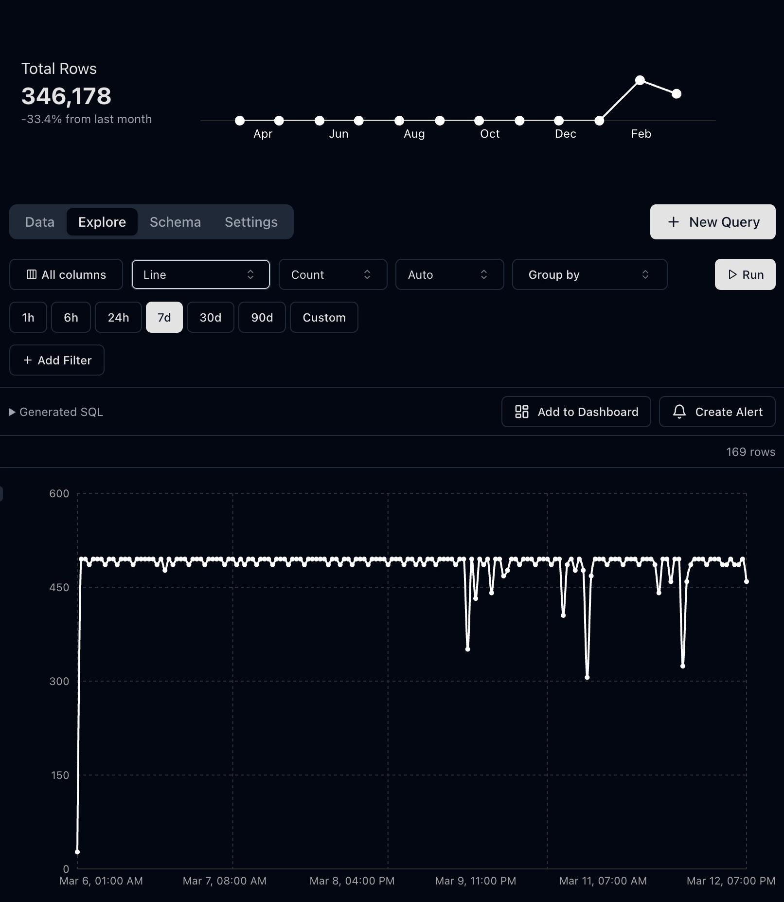
Hourly p95 latency from synthetic API events, with Monitor this result ready to open alert settings.
The inline Monitor this result prompt opens the same settings as Monitor result. Confirm the condition and recipients, then use Create Alert inside the dialog.
After creation, you will land on /team/{team}/alert/{alertSlug} where you can inspect status and event history.
Create an alert from SQL query results
- Open a saved query that returns one time column and one numeric signal.
- Run the query and switch to the Chart tab.
- Select a Line chart, set the time column as the x-axis, set the numeric signal as the y-axis, and leave Group by as None.
- Click Monitor result from the Results or Chart tab.
- Choose aggregation and threshold logic.
- Save and verify the alert detail page.
Alert condition fields
| Field | Meaning |
|---|---|
| Aggregation | How to combine values, such as avg, max, or p95 |
| Last N data points | Window size for evaluation |
| Ignore last data point | Skips newest row to avoid incomplete buckets |
| Comparison | >, >=, <, <= |
| Threshold | Numeric target for the comparison |
| Check interval | How often the evaluator runs |
| Recipients | Email addresses for notifications |
Interactive inline examples
Example 1: API p95 latency regression
Open this Explore URL template and replace placeholders:
/team/{team}/table/{table}?tab=explore&graphType=line&agg=p95&metric=latency_ms&time=7dThen create an alert with:
- Aggregation:
p95 - Last N points:
5 - Comparison:
Greater than - Threshold:
850 - Interval:
Every minute
Example 2: Error surge detector
Run this query in your SQL editor:
SELECT
  date_trunc('minute', timestamp_utc) AS time_bucket,
  COUNT(*) AS errors
FROM
  http_logs
WHERE
  status_code >= 500
  AND timestamp_utc >= now() - INTERVAL '2 hours'
GROUP BY
  time_bucket
ORDER BY
  time_bucket DESC;
Create an alert:
- Metric:
errors - Aggregation:
avg - Last N points:
3 - Comparison:
Greater than - Threshold:
20
Example 3: Missing traffic detector
Use this when event volume unexpectedly drops:
- Build a chart or query that returns event counts over time.
- Create an alert using
sumover the last10points. - Set comparison to
Less thanand threshold to50.
If triggered, check ingestion services, queues, and cron workers.
Troubleshooting
- No notifications: verify recipient emails are valid and alert is enabled.
- False positives: increase
Last N data pointsor keepIgnore last data pointenabled. - Alert never triggers: lower threshold or confirm the selected metric column is numeric.